10 Charts Every Business Analyst Should Know How to Make in Python
Use Bar Charts and Grouped Bars When the Question Is “Compared to What?”
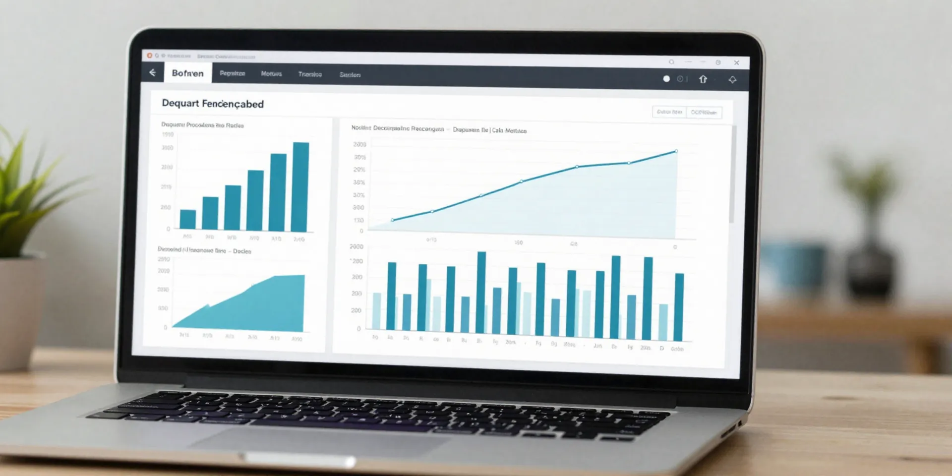
If you work with business data visualization, the humble bar chart is still doing a shocking amount of heavy lifting. For rankings, category comparisons, and quick executive reads, nothing beats it. Revenue by region. Tickets by team. Conversion rate by channel. A good bar chart lets the reader compare lengths fast, which is exactly what the brain is built to do. For python charts for analysts, this is usually the first thing worth learning well, not just learning once. Basic sorting, readable labels, and consistent color choices matter more than decorative styling.
Then there’s the grouped bar chart, which is what you reach for when a plain bar chart stops answering the real question. Not just “Which region sold more?” but “Which region sold more across each quarter?” or “How do product categories compare by customer segment?” This is where matplotlib basics really start paying off, because grouped bars can turn into a mess if spacing, legends, and ordering aren’t handled carefully. Keep the number of series limited. If people have to squint to find the second color in a 14-item legend, the chart has already lost. Bar charts are simple. But simple is not the same as easy.
Line Charts and Area Charts Make Time-Series Data Feel Obvious
When the x-axis is time, the line chart should usually be your first thought. It’s the cleanest way to show movement, direction, seasonality, and change points. Month-over-month sales. Weekly churn. Daily site traffic. You can show one series or a few, but don’t cram eight lines into one chart and call it insight. A line chart works because it gives shape to time. You can see a plateau, a spike, a collapse. That shape tells a story before anyone reads a label.
Area charts are useful when you want to keep the time trend but add a sense of magnitude. They work especially well for totals over time, or for stacked views when you want to show how parts contribute to an overall number. Still, they’re easier to misuse. Overlapping filled areas can hide smaller series, and stacked area charts become hard to interpret when categories change position a lot. Here’s the thing: if precision matters more than mood, use a line chart. If contribution to a total matters and the number of categories is manageable, area charts can earn their keep. A solid seaborn tutorial will show you the mechanics, but judgment is what separates a useful chart from a pretty blur.
Histograms and Box Plots Tell You What the Average Is Hiding
Averages are convenient. They’re also sneaky. If the average delivery time is three days, that sounds fine until you discover half the orders arrived next day and the other half took a week. That’s why analysts need histograms. A histogram shows the shape of a distribution: whether values cluster tightly, stretch into long tails, or split into separate groups. It’s one of the most practical tools in business analysis because operational metrics are often not normally distributed at all. Response times, order values, session lengths, support tickets per account — these metrics usually have quirks, and a histogram exposes them fast.
Box plots do something different but equally valuable. They summarize spread, median, and outliers in a compact visual, which makes them great for comparing distributions across groups. If you want to compare shipping times by warehouse or transaction values by customer tier, a box plot is brutally efficient. It won’t charm anyone, but it will tell the truth. And that matters. In Python, seaborn makes box plots quick to build, which is handy because you’ll often use them as a reality check before building fancier visuals. If your dashboard says performance is stable but the box plot shows widening variability and more outliers, trust the box plot.
Scatter Plots and Bubble Charts Reveal Relationships You Won’t See in Tables
Some business questions aren’t about totals or trends. They’re about relationships. Does higher discounting actually drive more units sold? Is customer tenure related to account value? Are slower response times linked to lower satisfaction scores? That’s where the scatter plot comes in. It’s one of the best charts for testing whether two variables move together, and just as importantly, whether they don’t. Tables can hide weak relationships under neat columns. Scatter plots force the issue. You see clusters, outliers, and empty spaces immediately.
Bubble charts take that same idea and add a third variable through point size. Used carefully, they’re excellent for business analysis: maybe x is growth rate, y is profit margin, and bubble size is revenue. Suddenly you have a practical portfolio view. But carefully is the key phrase here. Bubble charts can become unreadable if labels are crowded or size differences are too subtle. Scale bubble areas properly, not just the radius, or the visual impression will be misleading. Also, don’t use bubbles just because they look fancy. Use them when that third measure genuinely adds decision value. Otherwise a plain scatter plot is cleaner, and cleaner usually wins.
Heatmaps and Waterfall Charts Help You Explain Patterns and Drivers, Not Just Results
Heatmaps are perfect when you need to scan a lot of values and spot patterns fast. Think performance by region and month, retention by cohort and week, or support volume by weekday and hour. Instead of making the reader inspect a dense table, a heatmap turns the pattern into something visual: darker, lighter, hotter, colder. For business data visualization, that’s incredibly useful because many operational questions are really pattern-recognition problems. Where is demand clustering? Which cohorts are weakening? When do service issues peak? A heatmap won’t give you precise storytelling on its own, but it’s outstanding at showing where to look next.
Waterfall charts solve a different problem. They explain how you got from one number to another. Starting profit to ending profit. Beginning budget to actual spend. Last quarter’s revenue to this quarter’s revenue, with each driver shown as a step up or down. Executives love this chart when it’s done right because it translates variance into a sequence of causes. Analysts should know how to make it in Python even though it’s not always included in beginner matplotlib basics guides. And yes, it’s worth the effort. A KPI that moved is interesting. A KPI with visible drivers is actionable. Between heatmaps and waterfall charts, you move from “here’s what happened” to “here’s where the pattern lives” and “here’s what changed the number.” That’s real analytical work.